Case Study

IoT Platform 2.0
Making 2.0 more inclusive:
Usability and accessibility first
Overview
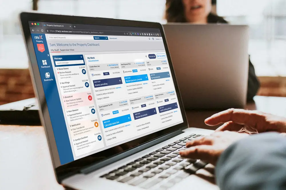
IoT Build was a key component of the Covisint Cloud Platform, but it was long overdue for a user-centered redesign. When OpenText acquired Covisint in 2017, the opportunity to reimagine the application as the OpenText IoT Platform was both timely and welcomed.
Context
- My Role
- Front-end Developer
- Product designer
- Teams
- Architecture
- Engineering
- Product owners
- QA
- Timeline
- 2019–2021
- IA
- Interaction design
- Prototyping
- Usability & testing
- User research
- UX strategy
- Adobe CS
- Axure
- Figma
- Sketch
- VS Code
The problem
Redesigning the IoT Platform was an exciting opportunity to remove obstacles and unlock its full potential. While the original version was usable, its steep learning curve held users back. We envisioned a platform that would empower them from the very first interaction.
While the original IoT Platform delivered on functionality, it fell short in providing an intuitive, user-centered experience. We set out to completely reimagine the platform by making the user our top priority and transforming the experience into one that is not just functional but truly empowering.
Based on user research these were the primary goals of the redesign:
- Reduce the learning curve when getting started with the platform
- Access and manage IoT devices more efficiently
- Configure and monitor devices with minimal technical expertise
Research and discovery
With our primary user group being the Professional Services team – the implementers of our IoT software for customers – I had direct access to a wealth of firsthand experience. This facilitated extensive user research, employing methods such as interviews, surveys, competitive analysis, and usability testing. Several of these research initiatives proved particularly insightful and are elaborated on below.
Research methods
- Contextual Inquiry - Observer users in their context
- Observing workflow
- Shadowing users
- User Interviews - Discuss user needs, motivations
- 1-on-1 recorded sessions
- Group interviews
- Surveys
- Journey Mapping - visualize user experience and steps
- Current state
- Future state
Key findings
Simplicity beats feature overload
Users prefer clear, intuitive workflows over complex functionality. A streamlined experience improves engagement and reduces training time.
Visibility builds trust
Real-time feedback on device status, data, and alerts helps users feel in control. Without it, trust in the platform quickly drops.
Tailored experiences drive adoption
Role-based dashboards and workflows boost efficiency and satisfaction across diverse user groups—from techs to execs.
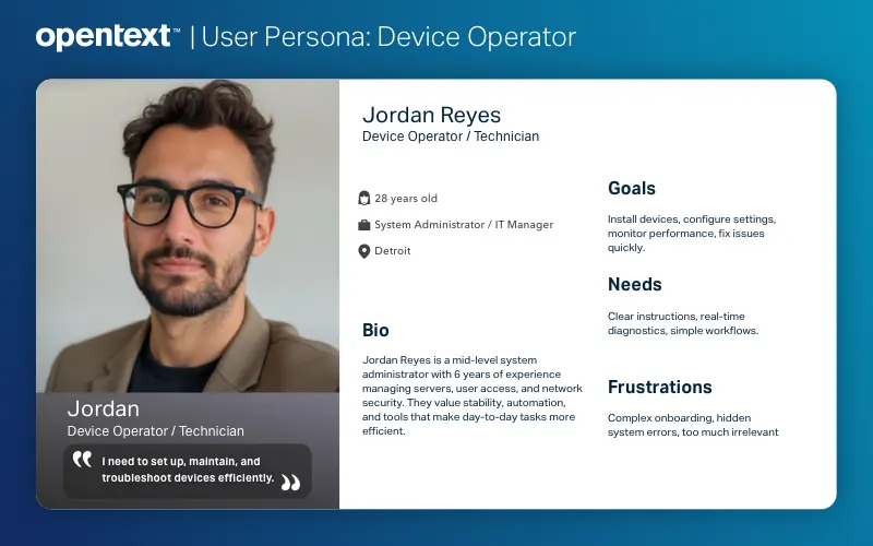
User personas
We identified multiple user personas across the IoT ecosystem, but prioritized the Device Operator/Technician for this phase. This user group interacts directly with the IoT platform, while others engage with different tools and touchpoints outside the application.
Ideation and design process
During this phase, I partnered closely with product managers, engineers, and QA to define and prioritize features for each design and development sprint.
Informed by user research, we analyzed current task flows to identify friction points and opportunities for simplification.
One major challenge was the fragmented process for creating a Digital Twin. Previously, users had to navigate a disjointed, nonlinear workflow. To improve this, we consolidated the steps into a single, cohesive flow—streamlining the experience and reducing user confusion.
User flows
During this phase, I partnered closely with product managers, engineers, and QA to define and prioritize features for each design and development sprint.
Informed by user research, we analyzed current task flows to identify friction points and opportunities for simplification.
One major challenge was the fragmented process for creating a Digital Twin. Previously, users had to navigate a disjointed, nonlinear workflow. To improve this, we consolidated the steps into a single, cohesive flow—streamlining the experience and reducing user confusion.
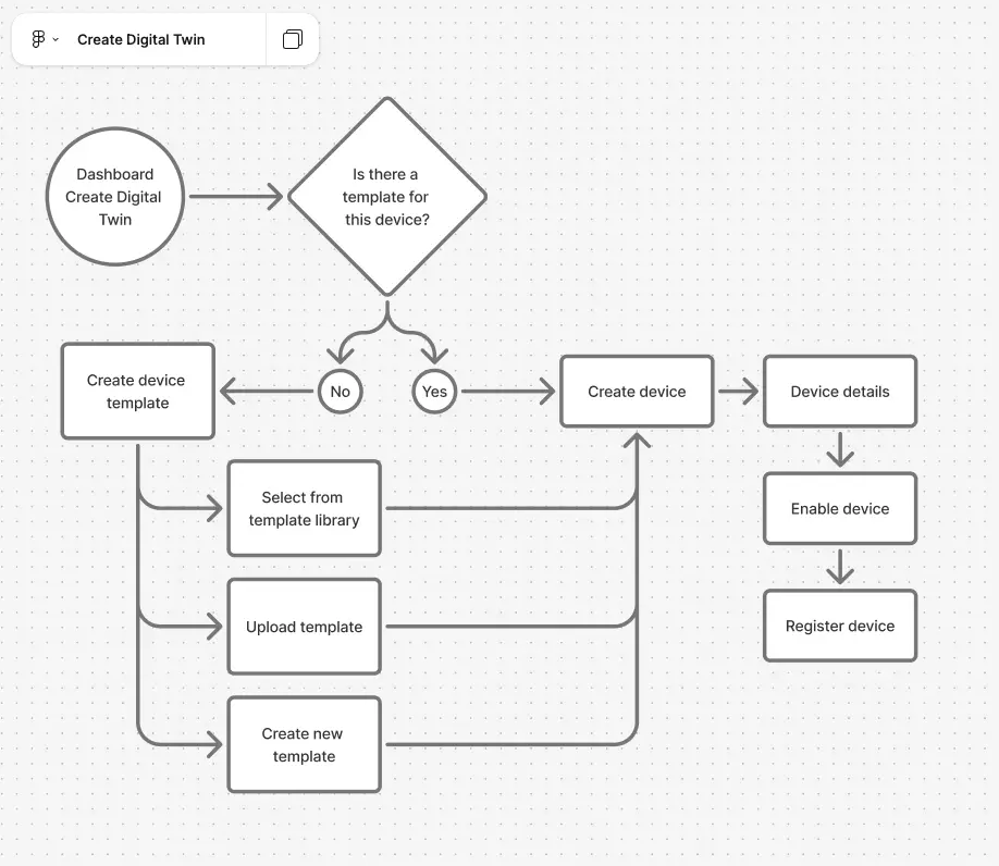
Next, I developed interactive prototypes in Axure, which allowed us to visualize and validate the end-to-end user flow. These clickable models enabled the team to collaboratively explore the experience, identify pain points, and uncover opportunities for improvement.
We tested multiple iterations, incorporating feedback from stakeholders and usability testing, until we arrived at a version that delivered the most intuitive and effective experience for our users.
Information architecture (IA)
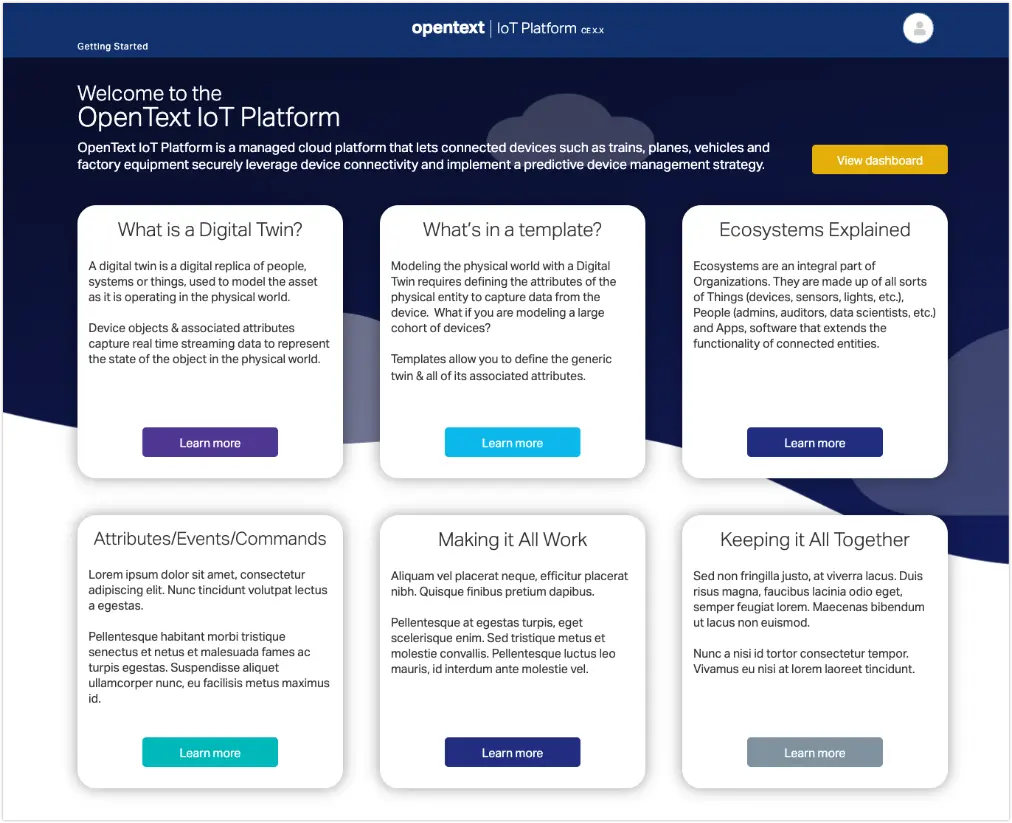
To make the platform more approachable, especially given the complexity of IoT, we introduced a “Getting Started” guide as the user’s landing page after sign-in. This onboarding experience provides contextual guidance, tutorials, and foundational IoT concepts to help users quickly understand how to navigate and use the platform effectively.
We restructured the navigation to group related items logically, making it easier for users to locate features and understand how different sections of the platform connect. This improved information architecture was informed by card sorting exercises, which revealed how users naturally categorize key functions. As a result, discoverability improved and the overall user experience became more intuitive.
Interaction design
Microinteractions were strategically implemented to reinforce data integrity and prevent errors.
For instance, on the Device Detail screen, the delete function is disabled for active devices. Attempting to delete an enabled device triggers a subtle notification guiding the user to disable it first, preventing accidental removal.
The delete option becomes available only after the device is disabled, with confirmation prompts ensuring deliberate action.

The Ecosystem Browser was a key UI feature designed to empower users to explore and construct their platform ecosystems intuitively. Drawing inspiration from the familiar and efficient column navigation of MacOS Finder, this pattern enabled a seamless experience for users to drill down through hierarchical levels of their ecosystem and create new entities precisely where needed within that structure. This approach aimed to provide a clear mental model of the ecosystem's organization and streamline the creation process.
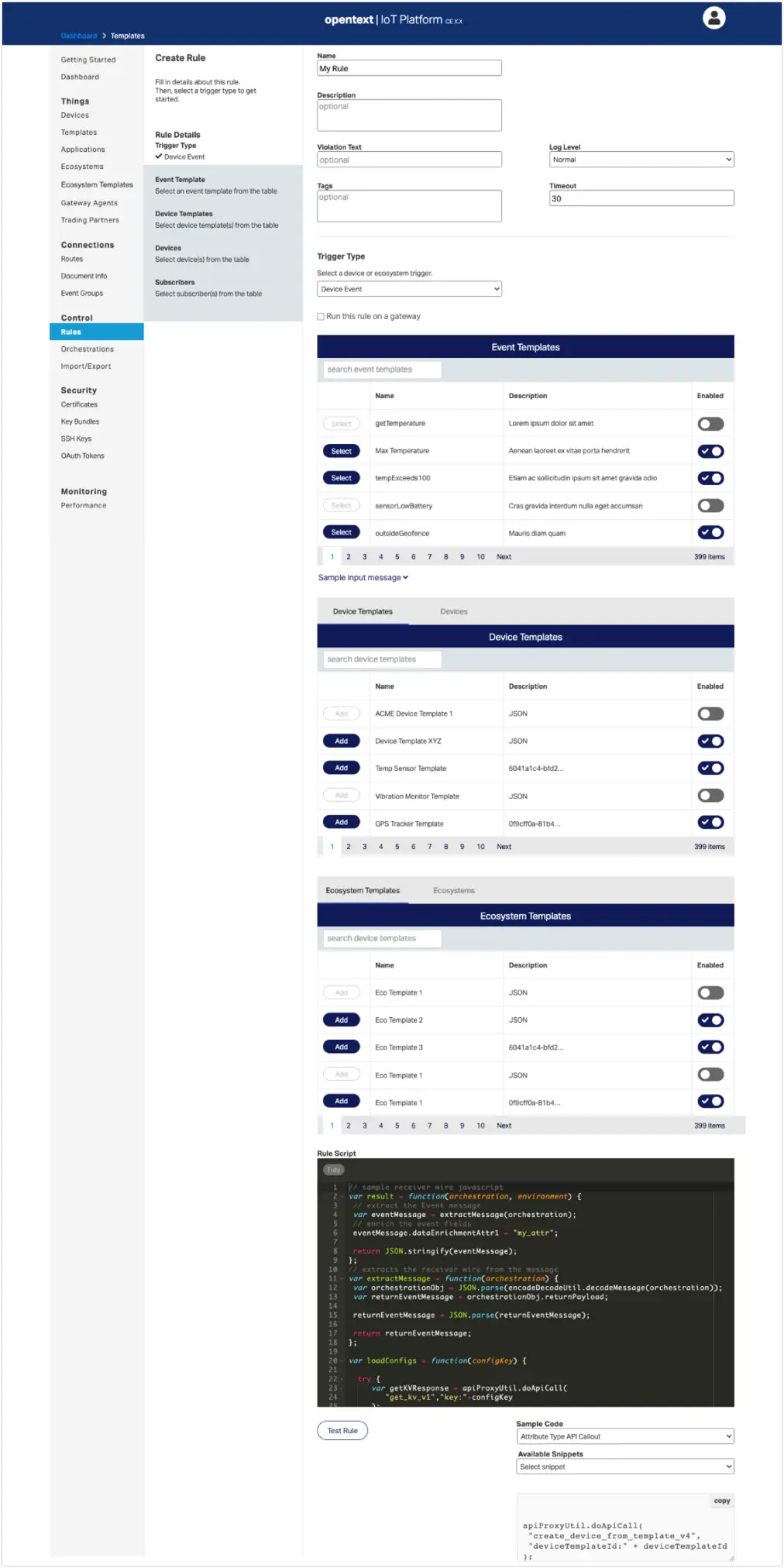
The "Create Rule" screen presented a complex UI challenge due to its layered functionality. Our solution was a two-column layout (excluding navigation) that separated user selections on the left from the dynamic rule-building interface on the right. This pattern allowed the right column to adapt its states based on the left-column selections, providing crucial context. This design accommodated key elements such as:
- Disabled templates with a clear visual indication for enabling
- Tabbed navigation for efficient browsing of selectable items
- An embedded code editor for immediate rule testing
- A readily accessible library of sample code for quick copy-paste
By employing this layout, we aimed to provide users with a more organized and manageable experience when creating complex rules.
Results and impact
Reduced onboarding time by 40% after consolidating complex multi-step workflows into a single, guided setup experience.
Users completed key tasks faster with fewer errors, and support requests dropped significantly—especially among first-time users.
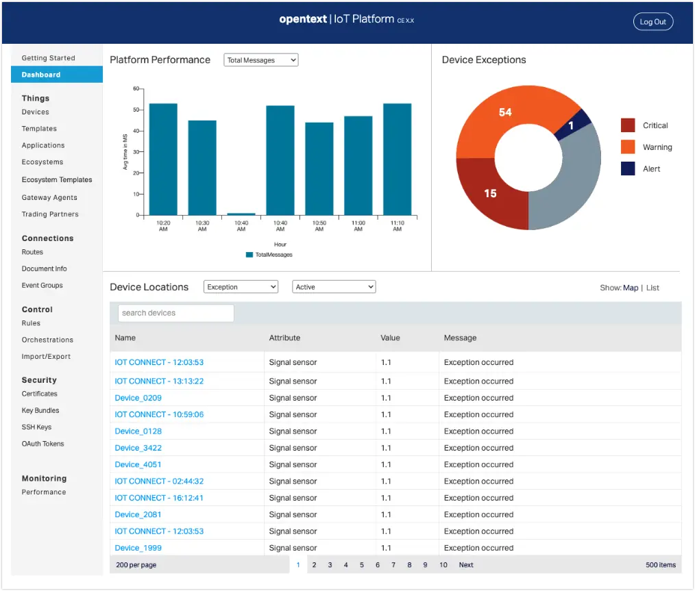
Introduced real-time device health indicators and alert logs, leading to a 65% increase in proactive issue resolution.
Users reported higher confidence in system reliability, and NPS scores improved by 22 points over three months.
Implemented role-based dashboards for technicians, managers, and executives, which increased platform usage by 50% among non-technical roles.
Stakeholders accessed relevant insights faster, enabling quicker decisions and better alignment across teams.